A practical guide explained for anyone who wants a clean mug design that stays readable once it wraps around a curved surface.
Custom mugs are popular for gifts, teams, and small events because they’re easy to distribute and easy to use. The design constraints are less obvious: handles interrupt the “front,” artwork curves away from view, and small details can disappear once printed on glossy ceramic.
This guide is for beginners who want a quick, reliable workflow and for small teams making multiple versions (names, dates, departments). The steps are built around checkpoints that prevent common failures: picking the right print area, keeping content out of handle zones, exporting at exact dimensions, and verifying the preview from multiple angles.
Mug printing tools differ most in how they handle wrap boundaries and how consistently their exports preserve size and sharp edges. A dependable process keeps one source layout and produces a print-ready file from it, rather than editing the final export repeatedly.
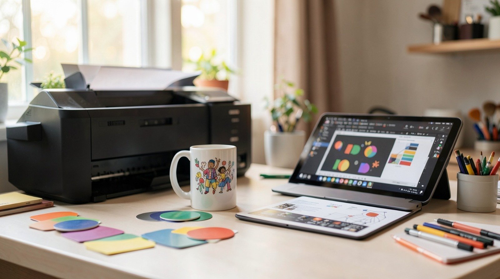
Adobe Express is a practical way to get started because it supports template-based layout work and common export formats that fit typical mug-print workflows.
Step-by-step how-to guide for using Mug Printing Tools
Step 1: Define the mug layout boundaries before you design
Goal
Create the design on the correct print area so placement and scaling stay predictable.
How to do it
- Identify the mug type (standard ceramic, travel mug, camp-style) because print panels vary.
- Decide whether you need one-sided, two-sided, or wrap printing.
- Mark “handle zones” where key text or faces shouldn’t land.
- Decide what should face forward when the mug is held (logo, name, short phrase).
- Build the first layout using a mug design from Adobe Express so your export aligns with print dimensions.
What to watch for
- Capacity (oz/ml) is not the printable area.
- A centered design can still feel off if it ignores the handle’s “front.”
- Thin borders make small placement tolerances obvious.
Tool notes
- Adobe Express is useful for getting a size-aware mug layout drafted quickly without starting from a blank canvas.
Step 2: Choose a concept that stays readable on a curve
Goal
Keep the design legible as the mug rotates and catches glare.
How to do it
- Pick one focal approach: short phrase, name, icon, badge, or photo + label band.
- Keep the main message to one strong line; treat secondary text as optional.
- Use thicker font weights for primary text.
- Keep key content away from the far left/right edges of a wrap design.
- If two-sided, make one side the “main” and keep the other simpler.
What to watch for
- Thin scripts and delicate serifs often lose clarity on curved surfaces.
- Busy layouts look cluttered once the mug is partially rotated.
- Small secondary lines disappear first in real use.
Tool notes
- A thumbnail view (zoomed-out check) is a fast proxy for arm’s-length readability.
Step 3: Prep images and logos so edges print cleanly
Goal
Avoid soft edges and pixelation that show up on glossy ceramic.
How to do it
- Use the highest-resolution source files available; avoid screenshots and tiny downloads.
- Prefer clean logos/icons over busy photos when possible.
- Keep line weights thick enough to survive printing.
- If text overlaps a photo, add a solid band behind the text.
- Confirm rights for any third-party artwork, logos, or images.
What to watch for
- Low-resolution images can look fine on-screen and muddy in print.
- Dark photos can lose detail in shadow areas.
- Tiny text embedded in images rarely survives at mug size.
Tool notes
- Keep original assets separate from exports so you don’t accidentally reuse a compressed file later.
Step 4: Place content with “handle-first” logic
Goal
Prevent the handle from interrupting the most important content.
How to do it
- Decide whether the primary view should work for right-handed, left-handed, or both.
- Keep names, faces, and key words away from the handle boundary zones.
- Leave extra breathing room near wrap edges.
- Avoid thin border frames; rely on negative space for structure.
- Re-check balance by imagining the mug rotated 30–60 degrees.
What to watch for
- Text near the handle can look visually “cut.”
- Wrap edges can feel cramped even when the center looks fine.
- Borders magnify normal print placement shifts.
Tool notes
- If placement only looks right when perfectly centered, the layout likely needs a clearer “front” and more margin.
Step 5: Choose colors that survive real lighting
Goal
Maintain contrast so the design reads in kitchens, offices, and indoor lighting.
How to do it
- Choose high-contrast combinations for text and key shapes.
- Avoid light-on-light palettes for primary information.
- Treat gradients as optional; solid fills reproduce more predictably.
- If using photos, lift shadows slightly to preserve detail.
- Check readability on a dimmer screen setting as a quick reality check.
What to watch for
- Dark backgrounds can print heavier and hide detail.
- Low contrast can fail under indoor lighting.
- Fine shading can flatten on glossy surfaces.
Tool notes
- Coolors can help you keep a small, consistent palette when you’re creating multiple mug variants.
Step 6: Export at exact size and verify crispness
Goal
Deliver a file that prints at the intended dimensions without surprise scaling.
How to do it
- Confirm the print workflow’s accepted formats (often PNG/JPG/PDF).
- Export at the exact required dimensions; avoid “fit to page” scaling.
- Re-open the export at 100% zoom and inspect text edges and thin lines.
- Name the file clearly (DesignName_Size_Version) and store “finals” separately.
- If you revise, regenerate the export and re-check the preview.
What to watch for
- Compression can soften edges (especially in JPG).
- Wrong dimensions can trigger printer-side scaling and blur.
- Small edits can shift spacing; re-check margins after changes.
Tool notes
- A simple version ladder (v1 → v2 → final) prevents most mix-ups when you’re in a hurry.
Step 7: Review the preview from multiple angles before ordering
Goal
Catch handle conflicts and wrap crowding while changes are still easy.
How to do it
- Rotate the preview and check both the primary view and handle-side views.
- Confirm the main message stays readable when partially rotated.
- Check that wrap edges don’t feel cramped.
- If two-sided, verify both sides are oriented correctly.
- If anything feels borderline, simplify and re-export rather than shrinking text.
What to watch for
- Some previews flatten curvature; assume real mugs hide more at edges.
- “Barely readable” on-screen usually fails in-hand.
- Borders can look uneven if placement shifts slightly.
Tool notes
- Notion can work as a quick one-page “order record” (final file name + notes) so you don’t lose track of what you approved.
Step 8: Organize delivery and reorders so the “final” stays final
Goal
Keep multi-mug runs manageable and reorders consistent.
How to do it
- Save a reorder-ready package: final export, dimensions, mug type notes, and a screenshot of the approved preview.
- If making multiple versions (names/teams), map each version to one export file.
- Keep quantities tied to version names to avoid swaps.
- Store everything in one place so you can repeat the order without rework.
- If shipping to multiple addresses, keep a destination list linked to versions.
What to watch for
- Reorders drift when specs aren’t written down.
- Similar filenames cause variant mix-ups.
- Multi-address shipping increases the chance of quantity errors.
Tool notes
- Shippo can be useful when mugs are shipped to multiple addresses and you want consolidated labels and tracking.
Common workflow variations
- Name mugs for teams or classrooms: Keep one master layout and swap only the name line. This reduces layout drift and makes reorders easier.
- Photo mugs for gifts: Use one strong photo and add text on a solid band. Keep faces away from handle zones and wrap edges.
- Two-sided “front + back” mugs: Put a logo or name on the front and a short phrase on the opposite side. Keep both sides simple and readable.
- Wrap-around quote mugs: Keep the quote short and use larger text than you think you need. Validate with rotated previews.
- Event-date mugs: Add the date as a small footer only if it passes the real-size readability check; otherwise, keep the design timeless.
Checklists
Before you start checklist
- Confirm mug type and printable area guidance.
- Decide one-sided, two-sided, or wrap printing.
- Identify handle zones and define the primary viewing side.
- Draft the message and confirm spelling.
- Gather high-resolution images/logos and confirm usage rights.
- Choose a small, high-contrast palette.
- Set a naming convention for versions/variants.
- Note deadlines and whether proof/preview review time is available.
Pre-export / pre-order checklist
- Confirm key content stays away from handle boundaries and wrap edges.
- Check readability at a zoomed-out view.
- Inspect text edges and thin lines at 100% zoom.
- Export at exact size in the required format.
- Save final exports separately from drafts.
- Review the preview from multiple angles.
- Record the final file name and mug type for reorders.
- Save a preview screenshot with the final file.
Common issues and fixes
- Text looks smaller on the mug than expected
Increase font size and reduce wording. Curvature and viewing distance make text feel smaller than it appears on a monitor. - Design feels off-center once printed
Center based on the mug’s “front” relative to the handle, not the full wrap width. Avoid thin borders that magnify small shifts. - Images look blurry or muddy
Replace low-resolution sources and avoid heavy compression. Brighten photos slightly and reduce deep shadows to preserve detail. - Important content lands too close to the handle
Move key elements inward and treat handle-side zones as no-go space. Re-check with rotated previews. - Colors print darker than expected
Increase contrast and lighten dark fills. Avoid subtle gradients that flatten on glossy surfaces. - Printed size is wrong
Reconfirm required dimensions and export settings. Disable auto-scaling behaviors and re-open the export at 100% to verify. - Wrong version gets ordered
Lock a “final” folder and keep strict version naming. Save an approved preview screenshot alongside the final export.
How To Use Mug Printing Tools: FAQs
Template-first vs. specs-first: which approach is better?
Template-first is faster for simple designs. Specs-first is safer when printable areas vary by mug type or when handle zones are strict. Many workflows draft quickly, then validate placement with previews before exporting finals.
What file type is safest for mug printing?
Use the format the print workflow requests at exact dimensions. PNG and PDF often preserve crisp edges better than heavily compressed JPG. Always re-open the export at 100% zoom before ordering.
One-sided, two-sided, or wrap: how do I choose?
One-sided is simplest and keeps the focal point clear. Two-sided works well for a front mark and a secondary message. Wrap designs can look cohesive but require extra care around edges and handle zones.
How do I keep multiple name variants consistent?
Use one master layout and change only the variable line. Keep strict naming (Name_Variant_Version) and store finals in a dedicated folder so the correct file gets ordered each time.
What’s the fastest way to catch handle-related mistakes?
Rotate the preview and look for key text crossing into handle-side zones. If anything important sits near that boundary, move it inward and re-export before ordering.